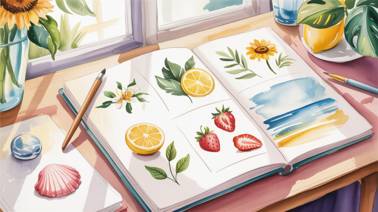
10 easy landscape watercolor ideas
Sometimes you sit at your desk and long for a small creative escape. A soft watercolor sky or gentle rolling hills can help you let go of everyday thoughts for a moment. Often, a simple motif is all it takes to capture a sense of calm and beauty. In this article, you’ll find ten easy landscape ideas you can create with just a few brushstrokes.
How to Start Drawing
Many people feel overwhelmed because they think landscapes need to be complex and full of detail. In reality, it’s enough to focus on large shapes and harmonious color transitions. A minimalist approach helps you stay focused and relaxed. This way, you can build a beautiful and atmospheric piece step by step.
- simple basic shapes
- limited color palette
- light brushstrokes
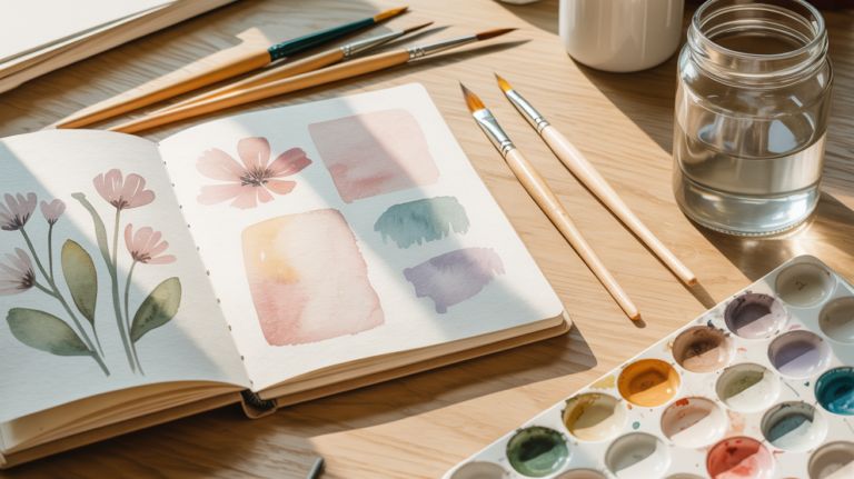
Simple Supplies for This Style
A small watercolor set, a medium round brush, watercolor paper, and some water are all you need to paint your landscapes.
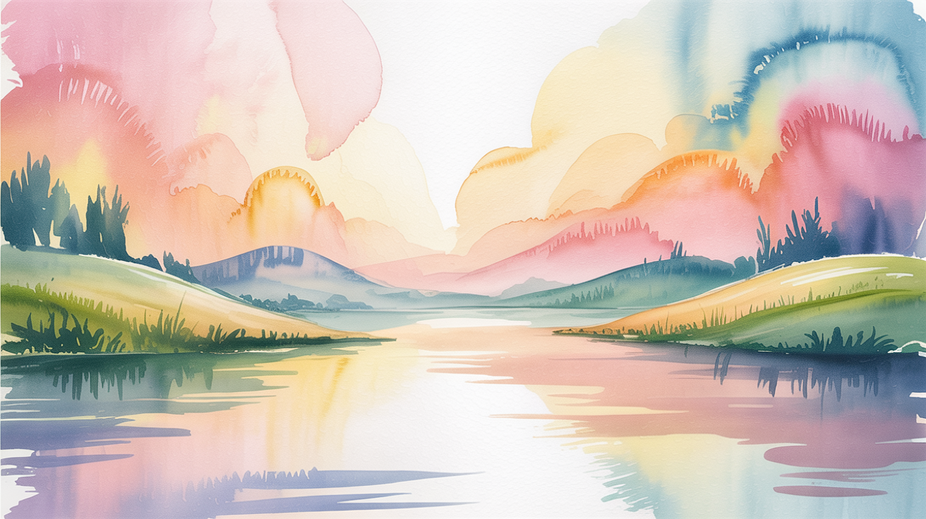
Sunset by the Lake
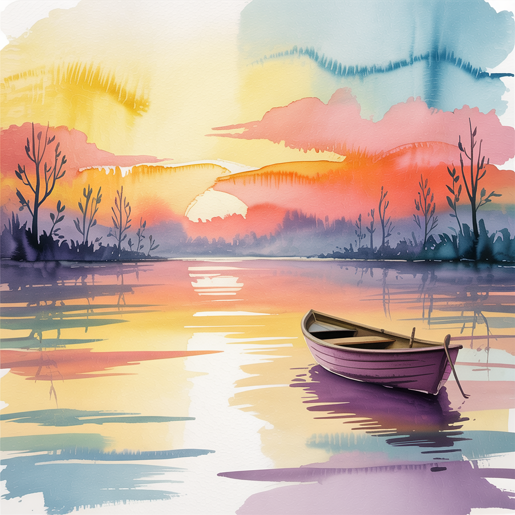
A calm sunset reflects gently on the clear water. The gradients between orange, pink, and blue create a relaxed mood. This motif is perfect for beginners because it relies on just a few color transitions.
The lake in the foreground helps repeat the warm tones of the sky in a simple way. Small silhouettes of trees or boats add depth without requiring many details. This creates a feeling of stillness and openness.
How to draw it:
- Wet the upper half of the paper and apply a gradient from yellow to orange and pink
- Let the colors blend softly into each other
- Paint the lake using a reversed gradient with horizontal strokes
- Add dark tree silhouettes along the shore with a fine brush
Rolling Hills
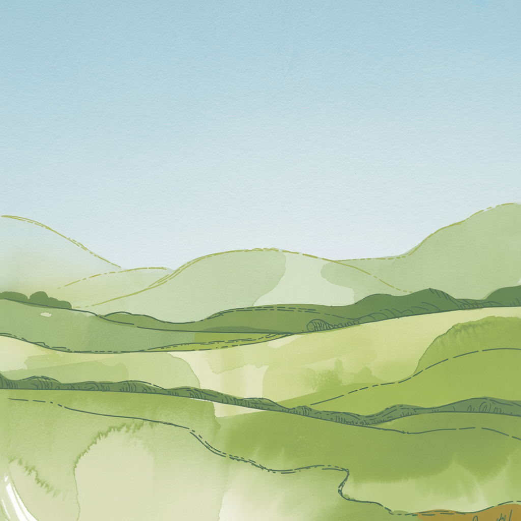
Gently curved hills invite you to daydream. Their flowing shapes can be sketched with just a few brushstrokes. A palette of greens with a touch of blue feels fresh and balanced.
The repeating waves of the hills create rhythm in the composition. With fine ink lines, you can suggest fields, paths, or hedges. This makes the scene feel alive without being overwhelming.
How to draw it:
- Lightly sketch the hills with a pencil
- Apply different green tones from back to front
- Leave some areas lighter for highlights
- Add subtle paths or hedges with fine lines
Mountain Silhouette
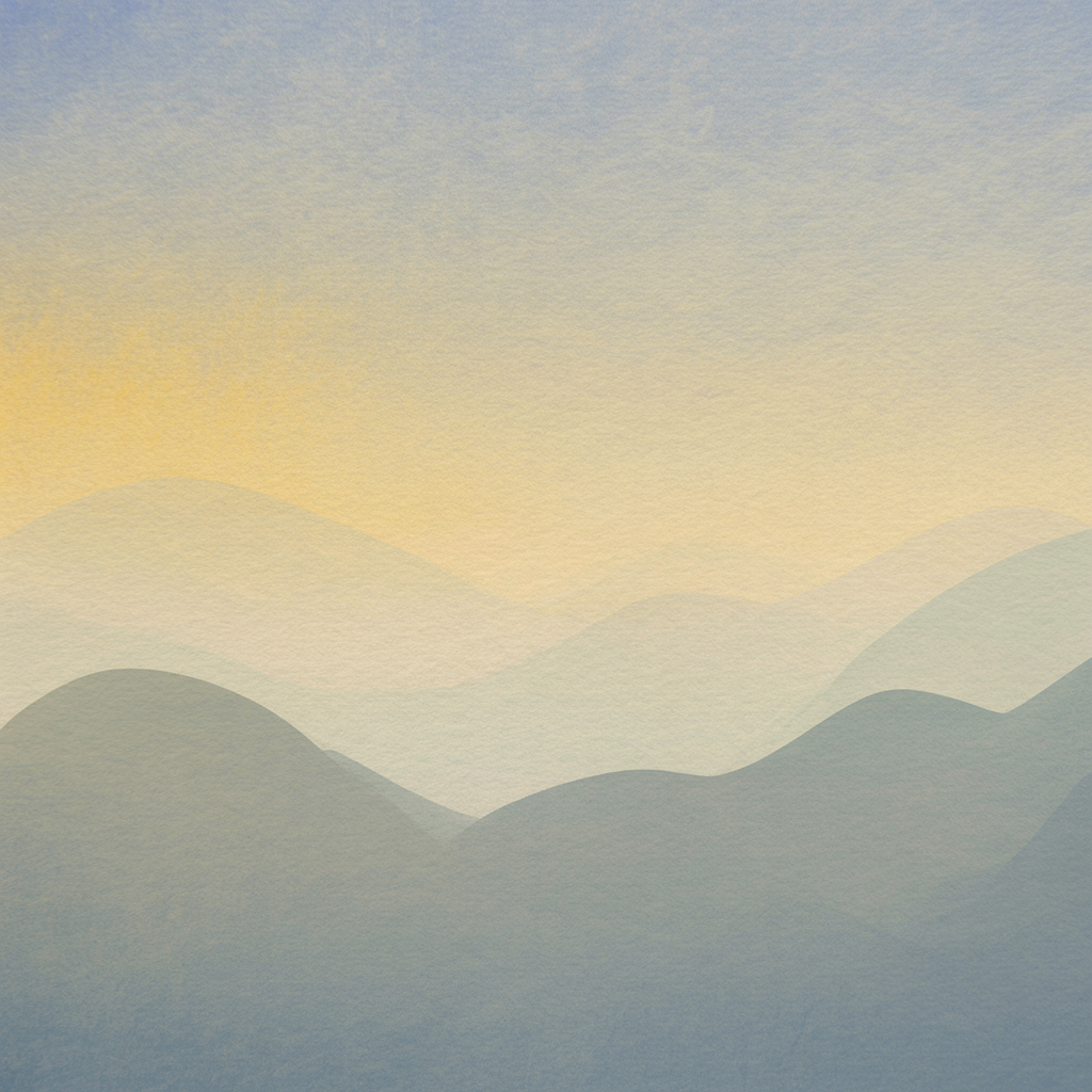
A mountain range as a dark silhouette against a bright sky feels calm and powerful. This motif is great for experimenting with color gradients, especially a soft transition from yellow to blue.
The mountain edges don’t need to be perfect. Irregular shapes give the image character and charm. With minimal effort, you can create a striking composition.
How to draw it:
- Fill the sky with a soft gradient
- Let it dry slightly
- Add a dark mixture for the mountains
- Leave a thin edge between sky and mountains for light contrast
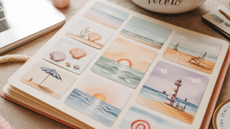
Beach Scene with Palm Tree
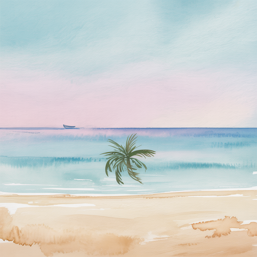
A palm beach instantly brings a vacation feeling. The composition is simple: sky, ocean, sand, and one palm tree. Clear color layers create depth.
The curved palm leaves soften the straight horizon line. A small boat or a simple beach umbrella can make the scene more lively.
How to draw it:
- Paint the sky and ocean in horizontal color bands
- Add light sand tones below
- Sketch the palm trunk and leaves
- Fill them with dark greens and browns
Forest Path
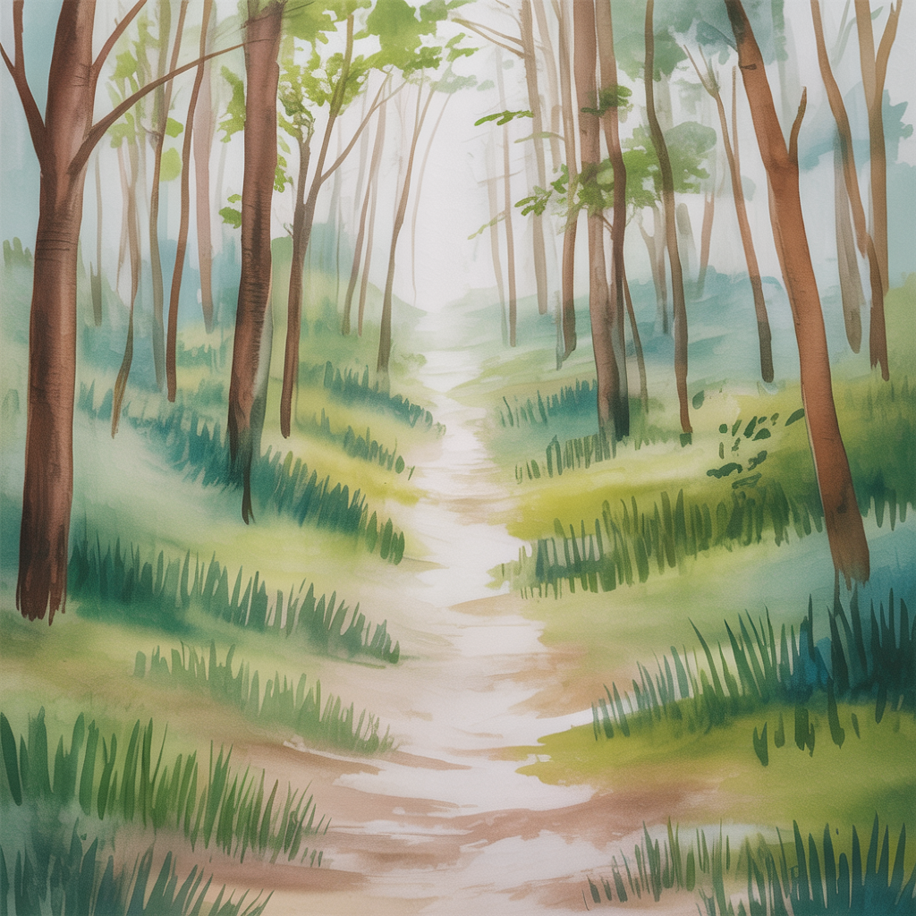
A narrow path winding through trees invites a quiet mental walk. To keep it open, make the path slightly wider in the foreground. A mix of green and brown tones adds richness.
The trees can stay simple. Thick trunks and soft leaf shapes are enough. Shadows on the ground add depth and atmosphere.
How to draw it:
- Paint the path in a light ochre tone
- Add tree trunks on both sides in different browns
- Dab green foliage onto the branches
- Add darker shadows along the path
Desert Dunes
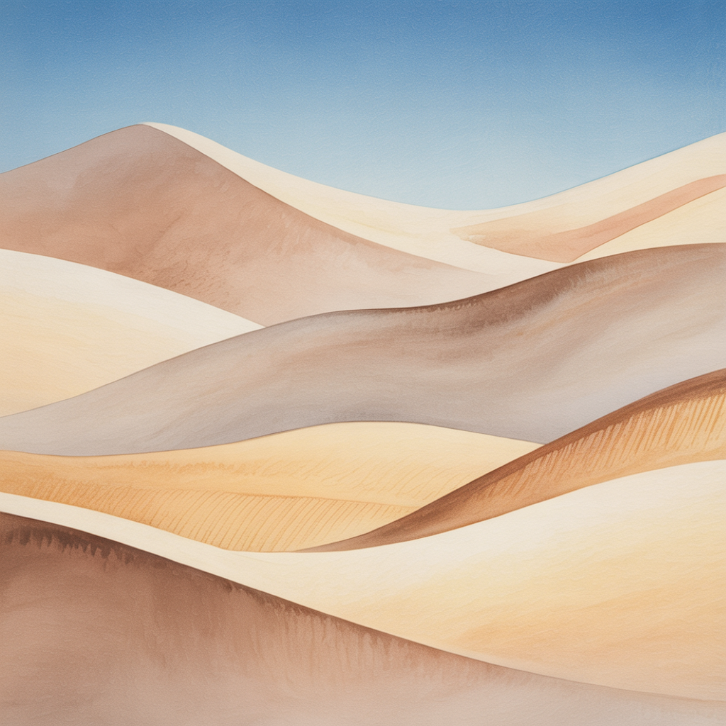
Desert landscapes are defined by soft, flowing shapes. With two or three sand tones, you can create beautiful gradients. A blue sky adds contrast.
Bright edges on the dune tops suggest sunlight and heat. Smooth transitions create a calm and open feeling.
How to draw it:
- Paint wide curved lines for the dunes
- Apply light to medium sand tones in layers
- Highlight some ridges with stronger ochre
- Keep the lower area lighter for light effects
Winter Landscape
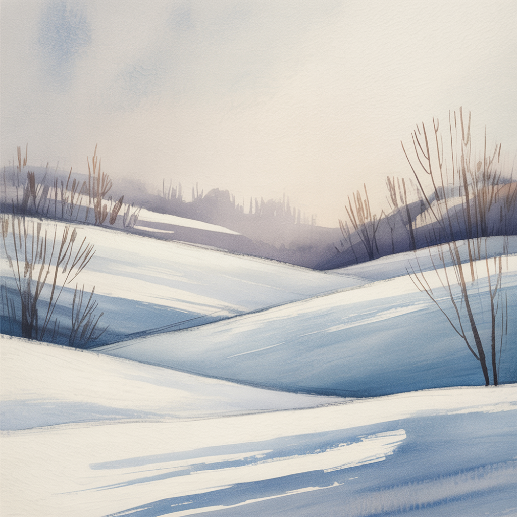
Snow-covered hills and bare trees create a cool, clear mood. Use soft blues and a touch of gray for shadows. A hint of pink or yellow can warm up the sky.
Simple tree shapes are enough to suggest a quiet winter scene. Leave large areas white and add only subtle shading.
How to draw it:
- Wet the sky and create a soft gradient
- Sketch hill lines lightly with pencil
- Add shadows using blue washes
- Draw fine lines for tree branches
City Skyline at Dawn
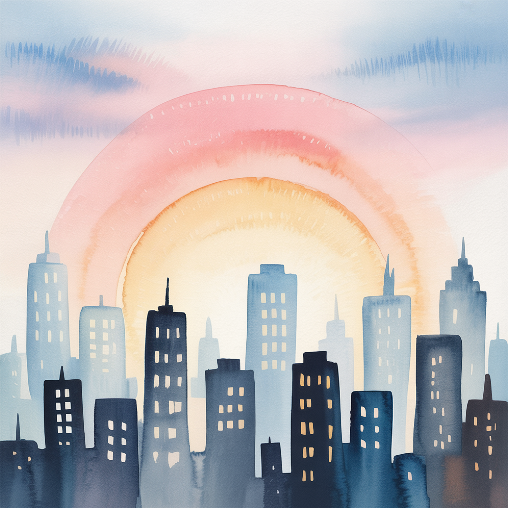
Backlight turns buildings into silhouettes, almost like a landscape. A bright strip at the horizon suggests early morning light. Dark building shapes create strong contrast.
A soft pastel palette keeps the scene calm. A few tiny light spots in windows bring it to life.
How to draw it:
- Paint the sky in soft pastel tones
- Draw the skyline in dark gray or black
- Add small light dots for windows
- Keep the foreground simple and dark
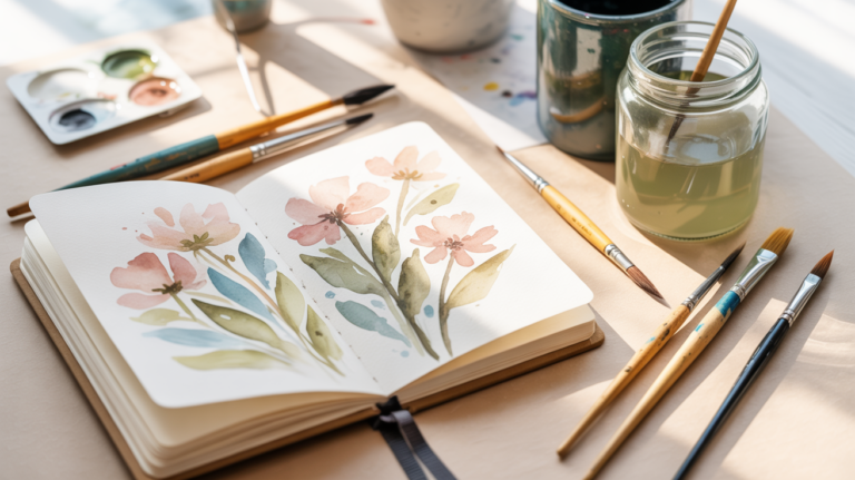
Wildflower Meadow
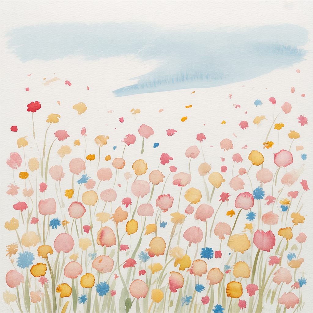
A field of flowers in soft tones feels lively and light. With a dabbing technique and a few colors, you can suggest a colorful meadow. Yellow, pink, and blue work beautifully together.
Irregular dots and splashes create the illusion of many small flowers. A few fine grass lines add structure.
How to draw it:
- Dab colorful dots onto the paper
- Mix yellow, pink, and blue in different intensities
- Use a fine brush for grass details
- Vary the dot sizes for a natural look
Autumn Forest Reflection
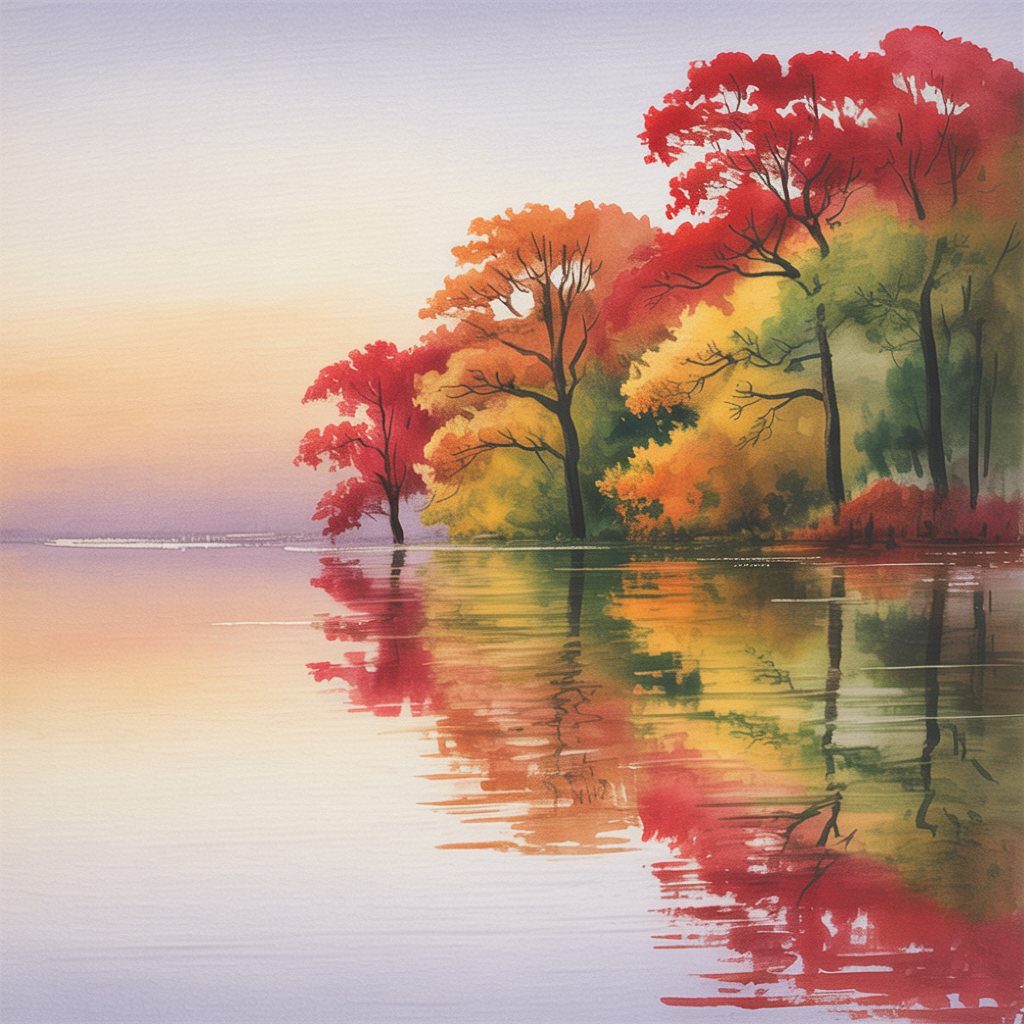
Autumn colors reflecting on calm water create warmth and depth. Reds and golds bring life to the trees, while the still surface mirrors them clearly.
The contrast between warm foliage and cooler water tones adds visual interest. A soft sky gradient completes the scene.
How to draw it:
- Paint the sky with soft yellow and blue tones
- Add tree tops in red, orange, and yellow
- Reflect the colors in the water with horizontal strokes
- Use darker tones to add depth
How to Use
Pick one idea and focus on the essentials. Start with soft color gradients and slowly build up details. Experiment with different shades and brush techniques. This way, you’ll naturally develop your own style.
Common Mistakes
Using too much water can cause colors to spread uncontrollably. Pay attention to drying time between layers. Very dark contrasts can flatten the image, so add highlights carefully. Avoid too many details too early.
FAQ
How do I choose the right colors?
Use a limited palette of up to five colors to keep everything harmonious.
What brush size works best?
A medium round brush, size 6 to 8, is very versatile.
How can I avoid water edges?
Work quickly and evenly without overworking the edges.
Let Your Creativity Flow
I hope these ideas bring you calm moments at your desk. Save your favorite motifs and try them in different color variations. Every brushstroke brings relaxation and small moments of joy. Come back anytime for fresh inspiration.